

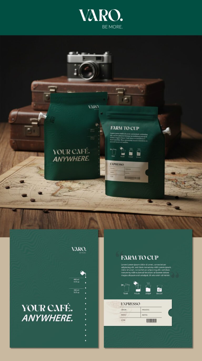
When we set out to design the packaging for VARO, we weren’t just looking for a vessel for coffee; we were looking to capture the spirit of the modern nomad. This deep, forest green palette was chosen specifically to evoke a sense of groundedness and heritage, bridging the gap between the rugged outdoors and the refined café experience. By positioning the product alongside vintage leather trunks and a classic rangefinder camera, we’re telling a story of curated exploration. The message is clear: whether you’re halfway across the globe or just in your backyard, you shouldn’t have to compromise on the quality of your brew.
From a technical standpoint, the architecture of the pouch is designed for utility without friction. We’ve integrated a precise pouring spout and a structured, gusseted base that ensures the bag stays upright on uneven surfaces—like a wooden camp table or a world map. The typography is bold and utilitarian, using a clean sans-serif that screams “essential gear.” We’ve treated the back of the pack like a field manual; the “Farm to Cup” section and the iconography for the brewing process are designed to be intuitive and quick to read at a glance, honoring the user’s time while emphasizing the premium nature of the “Expresso” (as styled for this specific market identity) inside.
This design moves your brand away from the cluttered, “crafty” look of standard coffee bags and into the lifestyle category of high-end adventure gear. The inclusion of the “Notes” and “Process” fields on the label invites the consumer into the technical side of the craft, treating them like a connoisseur rather than just a casual drinker. By framing the product against a map of the world, we are positioning VARO as the ultimate travel companion—a literal “Café Anywhere.” This isn’t just a purchase; it’s an invitation to the consumer to document their own journey, one cup at a time.