

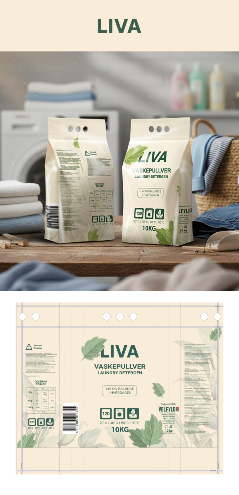
we’ve learned that laundry care shouldn’t feel like a chore—it should feel like a ritual of renewal. Our goal with this direction was to strip away the aggressive, chemical-heavy aesthetic common in big-box aisles and replace it with a “Quiet Premium” feel. We’ve utilized a soft, matte-finish palette of sage, sky blue, and oatmeal to differentiate the product line, creating a cohesive family that feels at home in a modern living space rather than hidden away in a dark cabinet.
The typography and iconography are where we really lean into that professional precision. By pairing a bold, clean sans-serif for the brand name with structured, minimalist data points—like the load count and temperature icons—we are communicating efficiency and transparency. Notice the leaf motif; it’s not just a decorative element. It serves as a visual metaphor for the “balance” mentioned in our copy, subtly signaling to the consumer that while this formula is powerful enough to handle 10kg loads, it remains grounded in eco-conscious sensibilities. It’s about building trust through clarity, not clutter.
Finally, the physical presence of the packaging was designed by our team to feel “human.” The tactile quality of the paper-feel bags and the wooden scoop in the lifestyle imagery emphasize a return to essentials. We aren’t just selling “vaskepullver” (laundry detergent); we are selling the peace of mind that comes with a clean, organized home. This design isn’t shouting for attention on the shelf—it’s commanding it through sophisticated restraint. It’s a design that respects the consumer’s intelligence and their aesthetic environment, ensuring LIVA becomes a staple of their lifestyle, not just their laundry room.