

When our team set out to design the Sila Calm identity, the goal was to move away from the clinical, sterile aesthetics that dominate the repair cream market and instead lean into a sense of profound restoration. The serif typography is the anchor of this brand; it’s bold and weighted to convey authority and reliability, yet the soft curves in the lettering mirror the soothing nature of the product itself. We’ve utilized a “seafoam and sand” palette—a sophisticated cream base paired with a deep, oceanic teal—to subconsciously trigger the feeling of a calm, revitalizing environment. It’s not just a cream; it’s a moment of respite for the skin.
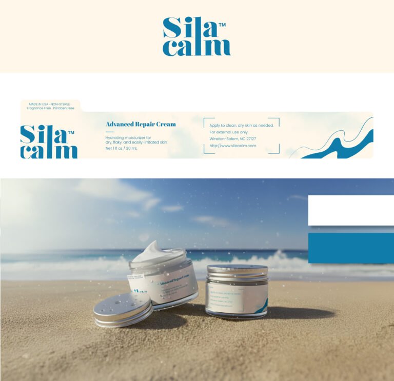
The label architecture is driven by clarity and breathability. In an era of over-cluttered packaging, we’ve used generous white space (or in this case, “cream space”) to allow the product benefits to shine without shouting. Notice the horizontal wave motif on the right flank: this serves as a visual metaphor for the skin’s moisture barrier being restored. By placing the “Advanced Repair Cream” designation alongside a clean, bracketed instructional block, we ensure the consumer feels guided and cared for. It bridges the gap between high-end luxury and pharmaceutical efficacy.
Our choice of a clear glass jar with a metallic, knurled lid is a deliberate nod to longevity and premium quality. In the lifestyle imagery, placing the product on a sun-drenched beach isn’t just about a “vacation vibe”—it’s about demonstrating the product’s role as a protective, hydrating shield against harsh elements. The way the light hits the texture of the cream highlights our formula’s richness and “spreadability.” This design doesn’t just sit on a shelf; it commands a presence on a vanity, signaling to our customers that their skin health is in capable, sophisticated hands.