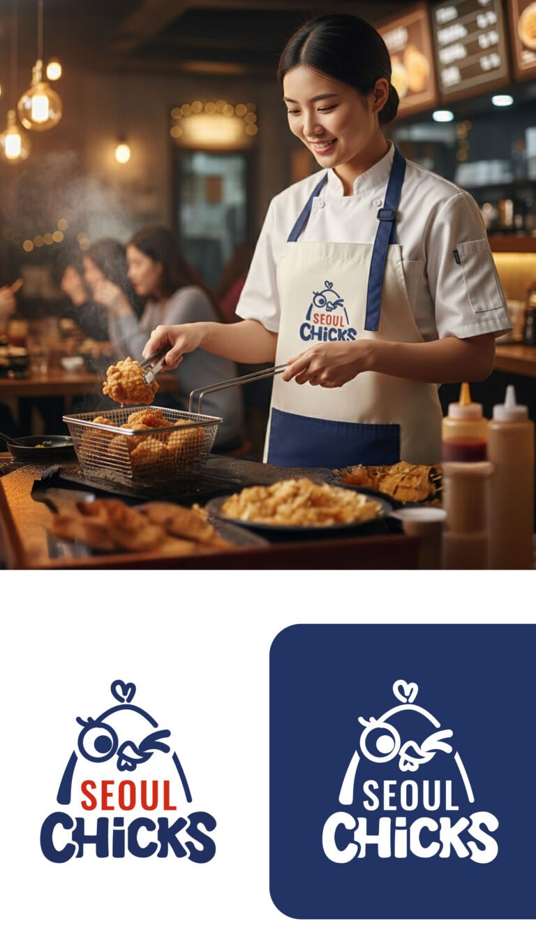

When we approached the branding for Seoul Chicks, the goal was to capture the high-energy, street-food soul of Korean fried chicken while giving it a distinct, memorable personality that stands out in a crowded urban landscape. We developed a mascot-driven logo that balances playfulness with a clean, modern edge. The winking chick character serves as an immediate “handshake” with the customer—it’s approachable, slightly cheeky, and promises a fun dining experience. By pairing this with a bold, rounded typeface in deep navy and vibrant orange, we’ve created a visual identity that feels both established and fresh.
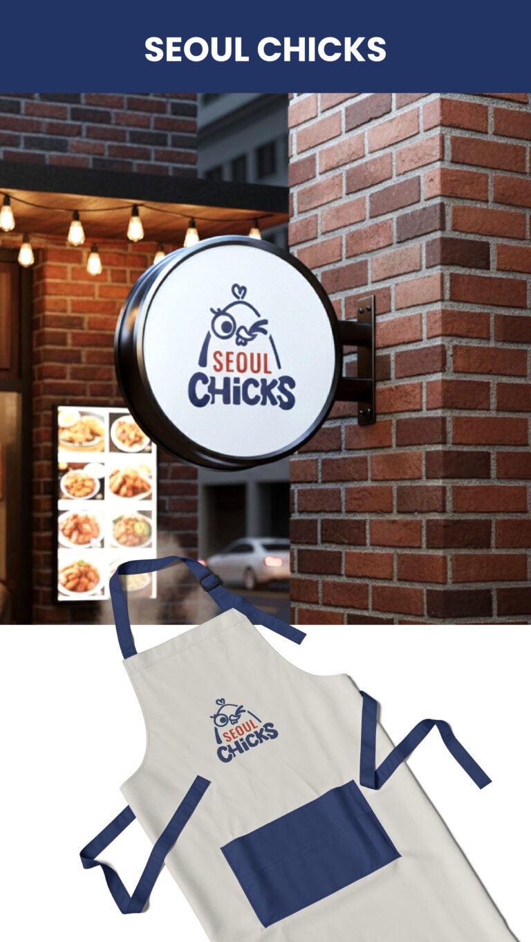
The choice of a circular blade sign for the storefront was a strategic move for maximum visibility. In a busy street environment, a circular shape breaks the grid of rectangular windows and doors, drawing the eye naturally toward the brand. The high-contrast white background ensures the logo is legible from a distance, whether it’s high noon or under the glow of evening streetlights. This isn’t just a sign; it’s a beacon for the brand, designed to be instantly recognizable to someone walking by or catching a glimpse from a passing car.
Beyond the logo itself, the overall “vibe” we are projecting is one of authentic urban warmth. By placing the branding against a classic red-brick texture and under warm Edison bulb lighting, we’re signaling to the consumer that this is a place of comfort and quality craft. The signage works in harmony with the real-world elements—the steam from the kitchen, the visible menu displays—to create an inviting atmosphere. This identity is built to scale; it’s a versatile system that will look just as impactful on a grease-proof takeaway bag as it does on this primary outdoor touchpoint.