

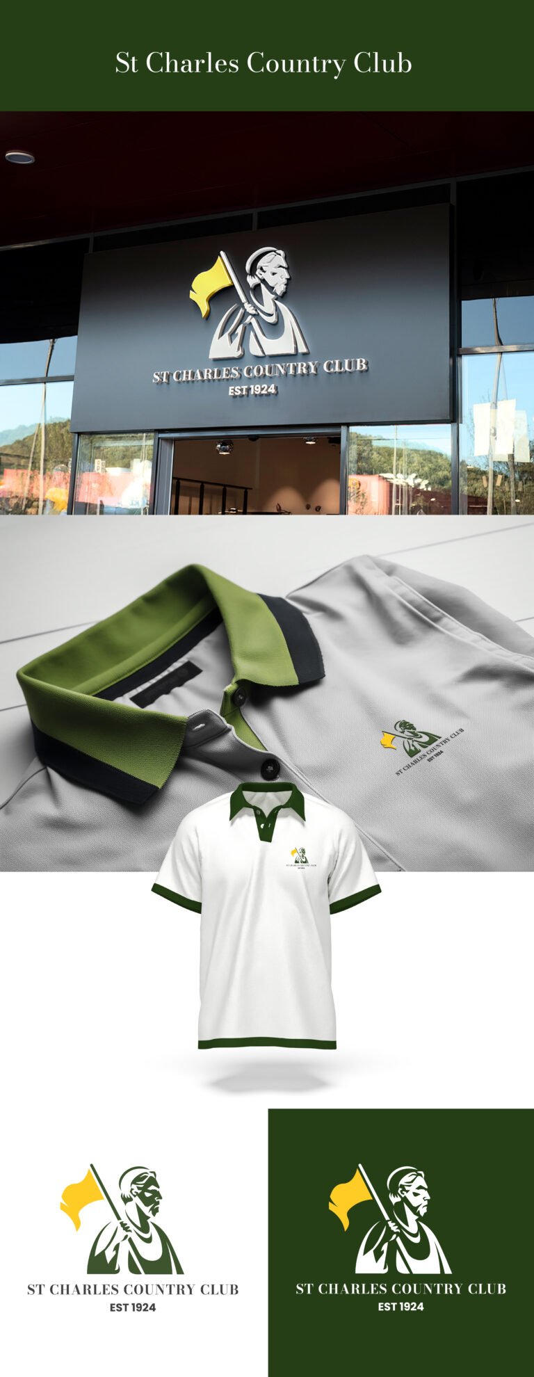
For the St. Charles Country Club visual identity, the objective was to bridge the gap between a storied century-old heritage and a modern, high-end membership experience. We’ve moved away from the cluttered, overly complex crests often seen in the industry to create a bold, iconic mark that commands respect at a glance. The central figure—a stylized, resolute character holding a gold flag—acts as a symbol of leadership and excellence, rendered with sharp, purposeful shadows to give it a timeless, sculptural quality that will look just as prestigious embossed on a leather scorecard as it will on a digital platform.
The color story is a deliberate nod to the “prestige of the green.” By pairing a deep, sophisticated forest green with a vibrant athletic gold, we are tapping into the traditional palette of the sport while ensuring the contrast is high enough for contemporary legibility. This specific green communicates stability and growth, while the gold flag adds a “hero” element, signifying the standard-setting nature of the club. It’s a color system designed to feel “old money” in its elegance but “new era” in its crisp execution.
Finally, the typography and the “Est. 1924” anchor are the foundational elements that seal the brand’s authority. We’ve utilized a clean, serif typeface that echoes the heritage of the early 20th century without feeling dated. By placing the establishment date prominently, we are reminding the audience that they aren’t just joining a club; they are becoming part of a century-long legacy. This brand identity doesn’t try to shout; it speaks with the quiet confidence of an institution that knows its value, providing a versatile asset that will represent St. Charles with pride for the next hundred years.