

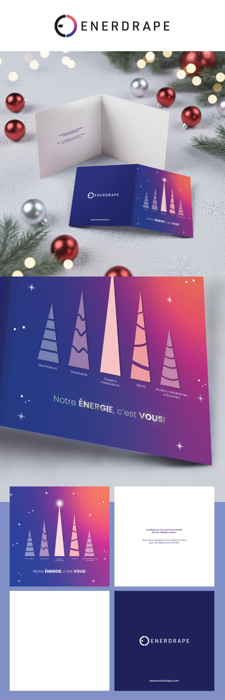
When we sat down to design this piece for Enerdrape, we wanted to move away from the clichés of corporate holiday cards. Instead of a literal Christmas tree, we used these stylized, ascending cones to represent growth and the different pillars of the company’s ecosystem, from suppliers and partners to the team and clients. By placing a glowing light atop the tallest peak, we aimed to symbolize a shared “North Star” or a collective energy that pulls everyone upward. It is a way of saying that while the technology is complex, the mission is simple and human-centric.
The color palette was a very deliberate choice. We shifted from a standard tech blue into a warm, sunset-inspired gradient of purples and pinks. This creates a sense of digital warmth, reflecting a company that deals with energy and heat in a way that feels approachable and festive rather than cold and industrial. The phrase “Notre ÉNERGIE, c’est VOUS!” (Our ENERGY is YOU!) serves as the emotional heartbeat of the design, directly linking the abstract shapes to the real people who make the work possible.
For the layout, we embraced a minimalist, balanced approach to give the message room to breathe. The interior is kept clean and quiet, allowing the bilingual holiday wishes to stand out without distraction. On the back cover, we anchored everything with the dark navy and the clean Enerdrape logo to ensure the brand felt grounded and professional. It is a design that values clarity and gratitude, intended to feel less like a mass-produced mailing and more like a sincere, thoughtful “thank you” to a community.