

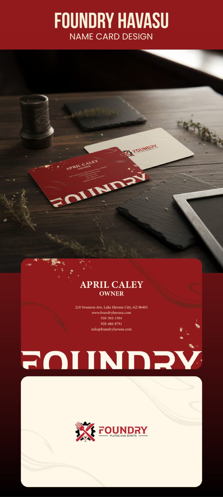
When we developed this business card for Foundry, we wanted the design to feel as robust and authentic as the brand itself. The deep red background on the front side was chosen to evoke a sense of warmth and industrial strength, reflecting the “foundry” name through a rich, earthen tone. We integrated organic, flowing lines and gold metallic splatters to break up the solid color, adding a layer of tactile visual interest that suggests the raw, creative process of making something by hand.
The typography was a careful exercise in balancing authority with approachability. We opted for a bold, serif font for the owner’s name, April Caley, to establish a clear professional identity, while the contact information is set in a clean, legible typeface to ensure effortless communication. By placing the large, cropped “FOUNDRY” text at the bottom, we created a strong visual anchor that makes the brand feel larger than life, almost as if it is being forged right onto the card.
On the back side, we transitioned to a light, cream-colored palette to provide a sophisticated contrast and give the brand’s logo plenty of room to breathe. The logo itself, featuring crossed culinary tools set against a gear, serves as the heart of the design and tells the story of the business at a single glance. We kept the surrounding space open and airy to ensure that when a client flips the card over, the focus remains entirely on the craftsmanship and identity that Foundry represents.