

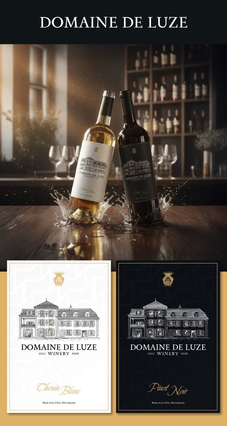
After a decade of refining brand identities, we’ve found that the most impactful designs live in the balance between heritage and modern precision. With these labels, we wanted to convey a sense of “Established Elegance.” The hand-sketched illustration of the estate isn’t just a picture of a building; it’s an invitation into the winery’s history. By using fine, architectural line work, we’re signaling to the consumer that what’s inside the bottle is crafted with the same meticulous attention to detail as the estate itself.
The meaning behind the stark high-contrast pairing—the ivory for the Chenin Blanc and the deep midnight for the Pinot Noir—is all about clear, intuitive storytelling. We chose a sophisticated serif typeface for the brand name to ground it in tradition, but we paired it with a clean, spaced-out sans-serif for the “Winery” text to keep it feeling current. If you look closely at the background, you’ll see a subtle, geometric watermark pattern; that’s our way of adding a “hidden” layer of luxury. It creates a tactile depth that suggests this isn’t just a standard supermarket wine, but a premium Swiss selection that rewards those who take a closer look.
Ultimately, we’re trying to convey a message of consistency through variety. Whether a customer reaches for the light or the dark bottle, the golden crest and the unified layout tell them they are getting the same level of prestige. The gold foil border acts as a literal “frame” for the art, elevating the label from a simple sticker to a piece of curated design. We wanted these labels to look just as beautiful on a candle-lit dinner table as they do on a high-end retail shelf, speaking softly but firmly about their Swiss origins in La Côte.