

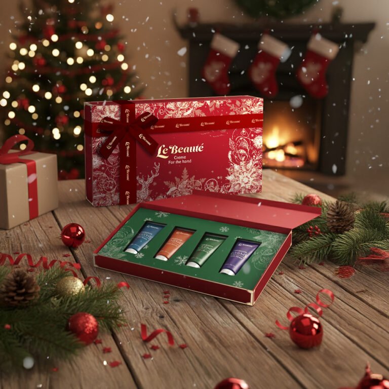
When we set out to design the Le Beauté Holiday Hand Cream Set, the goal wasn’t just to create a box; it was to bottle the emotional “high” of the holiday season. We leaned heavily into classic festive iconography—the intricate gold filigree, reindeer motifs, and snowflakes—but executed them with a fine-line illustrative style to ensure the brand maintains its premium, artisanal positioning. By using a deep, saturated crimson paired with high-contrast white and gold accents, we’ve created a piece that commands attention on a shelf while feeling like a bespoke treasure once it’s in the customer’s hands.
The “unboxing” experience is where the brand story truly comes alive. We transitioned from the warm, traditional red of the exterior to a lush forest green interior insert, creating a sophisticated color play that feels both nostalgic and high-end. Each of the four tubes—blue, copper, emerald, and violet—acts as a distinct sensory chapter. This variety doesn’t just showcase the product range; it reinforces the idea of “daily luxury,” giving the user a different aesthetic and aromatic experience for every mood or time of day throughout the winter months.
From a strategic marketing perspective, this design is a “ready-to-gift” solution. The integrated ribbon and branded bow detail eliminate the need for additional gift wrapping, which is a massive selling point for the time-strapped holiday shopper. We’ve positioned the product within an aspirational lifestyle setting—firelight, evergreen sprigs, and soft bokeh—to signal to the consumer exactly where this product belongs: at the heart of their holiday traditions. It’s elegant, it’s festive, and most importantly, it feels significantly more valuable than the sum of its parts.