

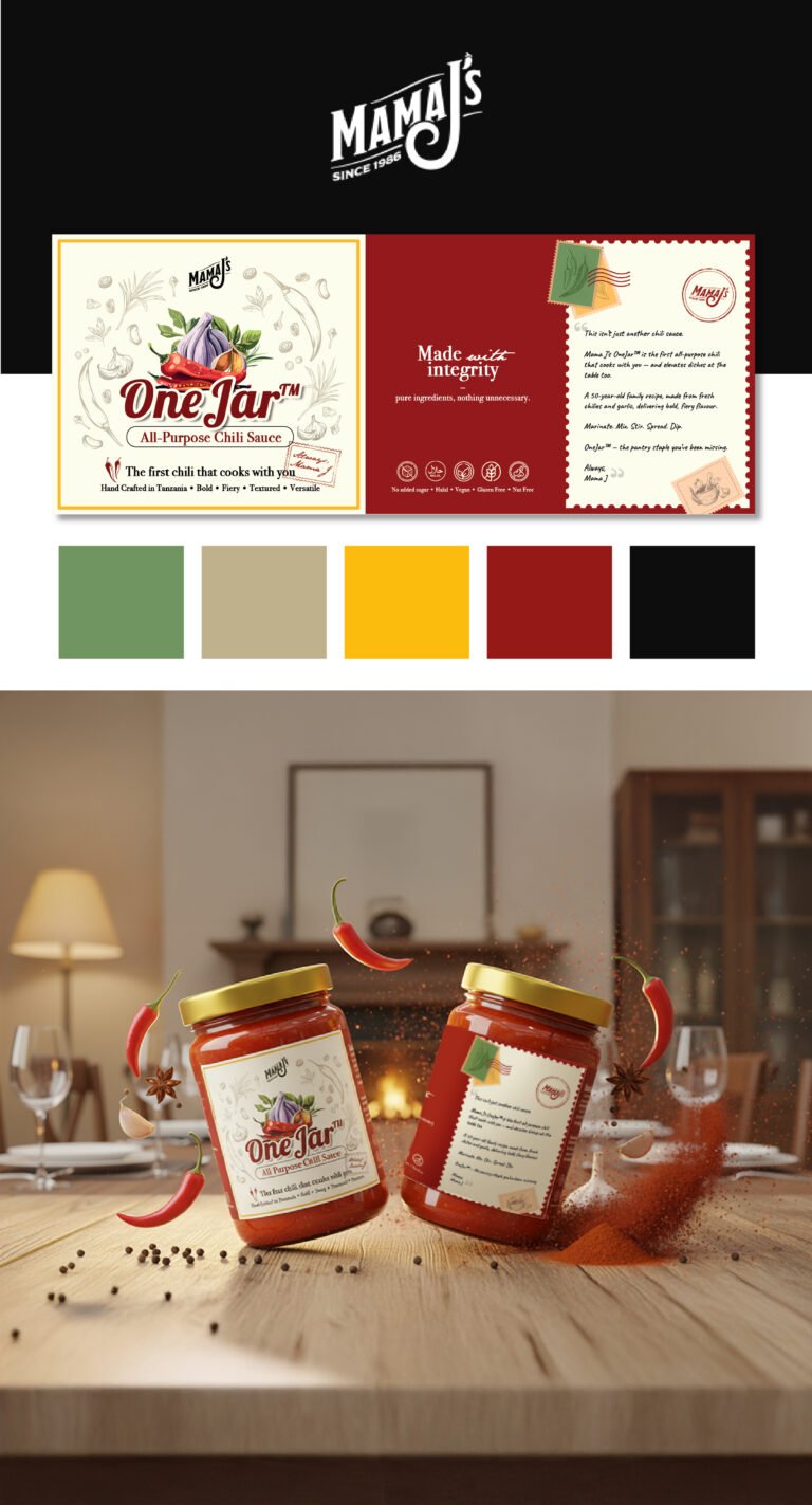
When we sat down to define the visual language for Mama J’s “One Jar,” the objective was to move beyond the typical “hot sauce” category and position this as a premium culinary staple. We wanted to capture the essence of a family heritage recipe while ensuring it looks modern and sophisticated enough for a high-end pantry. By utilizing a clean, cream-textured label backdrop, we’ve allowed the vibrant, rich red of the chili sauce to pop, while the hand-illustrated garlic and chili botanical sketches lend an air of artisanal authenticity and transparency about the ingredients inside.
The typography and layout were a very deliberate choice to balance authority with warmth. The “One Jar” wordmark is bold and grounded, signaling reliability, but it’s softened by the “Mama J’s” script, which adds that crucial human touch. On the back panel, we’ve moved away from the sterile look of standard nutritional layouts by introducing a “postal” aesthetic—complete with a stamp and a personal note from Mama J. This turns the packaging into a piece of storytelling, inviting the consumer into the brand’s history and making the product feel like a gift from a friend’s kitchen rather than a mass-produced commodity.
Strategically, the use of the gold lid serves as a “halo” for the product, signifying the premium quality of the contents. In this key visual, we’ve surrounded the product with an explosion of raw ingredients—whole chilies, star anise, and peppercorns—to communicate the complexity of the flavor profile at a glance. We aren’t just selling heat; we are selling a finished culinary experience. This design doesn’t just sit on a shelf; it commands it by promising the consumer that this is the only jar they’ll need to elevate their cooking.