

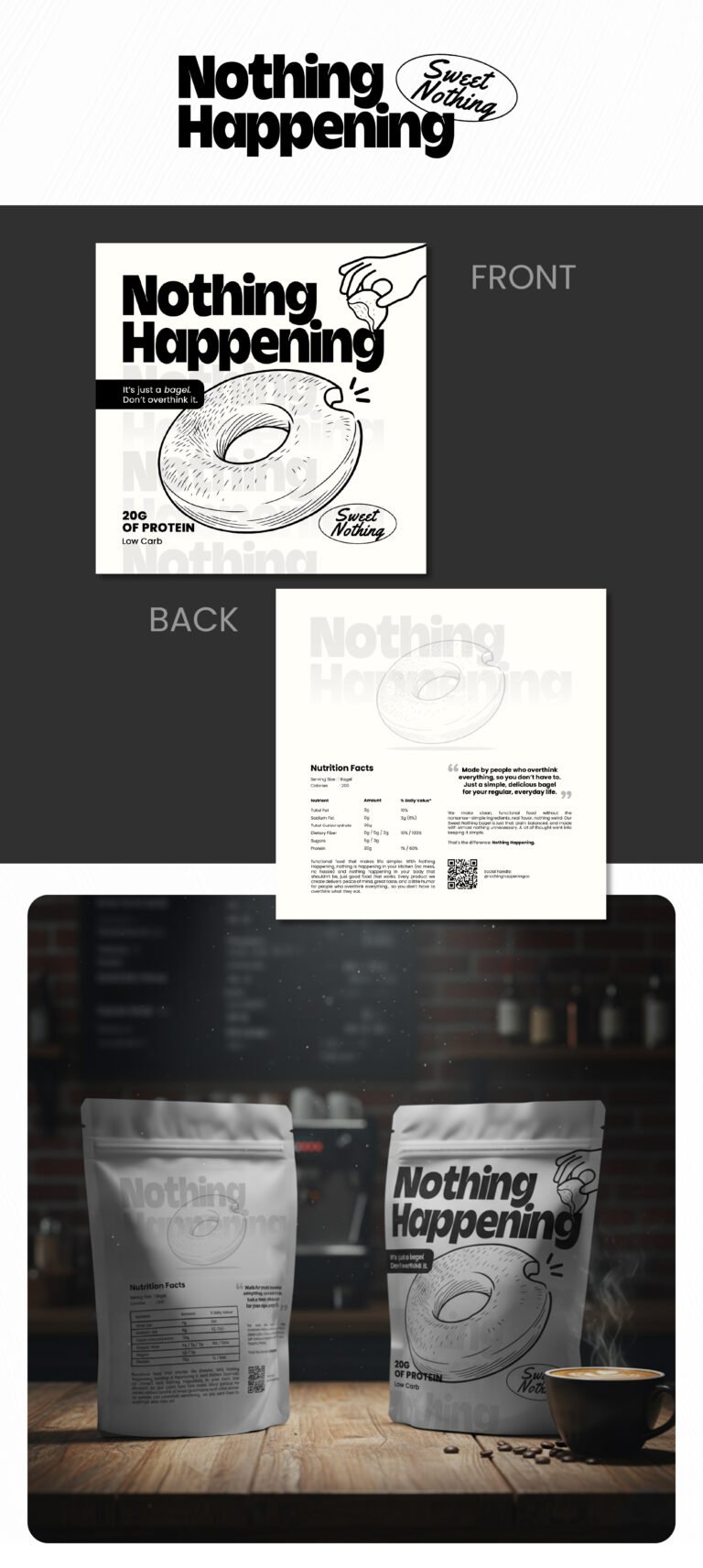
When we sat down to look at the “Nothing Happening” concept, we wanted to challenge the aggressive, over-saturated visual language that usually defines the protein and snack aisle. Most brands are screaming for attention with neon colors and chaotic fonts. Instead, we’re leaning into understatement as a power move. By using a stark, monochromatic palette and a matte finish, we’re signaling to the consumer that the product has nothing to hide. It’s a sophisticated, “anti-design” approach that feels premium and honest—perfect for a market that is increasingly skeptical of flashy marketing claims.
The typography and illustration are intentionally playful to balance that clinical minimalism. The bold, heavy sans-serif typeface gives the brand a solid, reliable “voice,” while the hand-drawn bagel sketch adds a layer of warmth and relatability. It tells the customer, “Yes, this is high-performance fuel (20g of protein), but it’s still just a bagel.” We’ve placed the nutritional facts and the bite-mark graphic front and center to lean into the transparency of the brand. It’s a visual nod to the fact that “nothing” is being added that shouldn’t be there.
Finally, we’ve designed this to live perfectly in the “lifestyle” space. Whether it’s sitting on a kitchen counter next to a morning espresso or tucked into a gym bag, the aesthetic is clean enough to look like a curated object rather than just a piece of trash. We are selling a moment of calm—a literal “nothing happening” break in a busy day. This design doesn’t just hold a product; it frames an experience that feels effortless, modern, and incredibly shelf-stable for a brand that wants to lead the conversation by lowering its voice.