

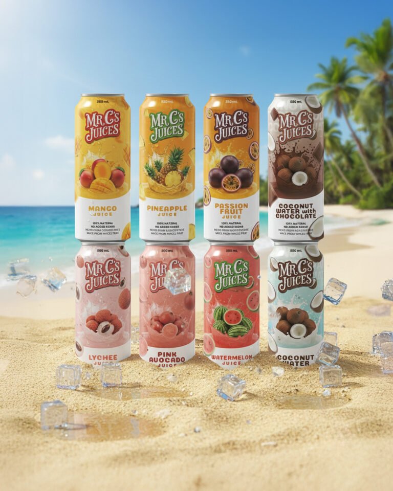
When we sat down to define the visual language for Mr. C’s Juices, the goal wasn’t just to put fruit on a can—it was to bottle the atmosphere of a high-end tropical getaway. We’ve moved away from the flat, minimalist trends that are saturating the market and pivoted toward high-energy hyper-realism. By utilizing a dual-tone “dipped” architecture, we create a clean white base for essential product information while the top half explodes with flavor. This ensures that whether these are sitting in a dimly lit cooler or on a sun-drenched beach bar, the customer’s eye is immediately drawn to the vibrant, splashing fruit imagery that promises instant hydration.
The typography and layout were meticulously balanced to bridge the gap between nostalgic authenticity and modern premium cues. The “Mr. C’s” script logo provides that approachable, “hand-crafted” heritage feel, while the clean sans-serif descriptors below offer the clarity today’s health-conscious consumer demands. We’ve also introduced a tactical color-coding system that allows for easy flavor navigation; the transition from the golden hues of the Pineapple and Mango to the creamy, indulgent tones of the Coconut Water with Chocolate tells a story of variety, moving the brand from a simple juice line to a comprehensive lifestyle beverage suite.
Finally, notice the environmental storytelling in our presentation. By placing the product in a high-shimmer, beach-front setting with suspended ice elements, we are selling the “perfect serve.” This design is built to perform exceptionally well in digital spaces—Instagram, e-commerce banners, and TikTok—where the tactile quality of the “splashing” fruit and the matte finish of the cans can truly pop. We’re not just asking the consumer to buy a drink; we’re inviting them into a moment of escapism. This isn’t just packaging; it’s a premium sensory invitation.