

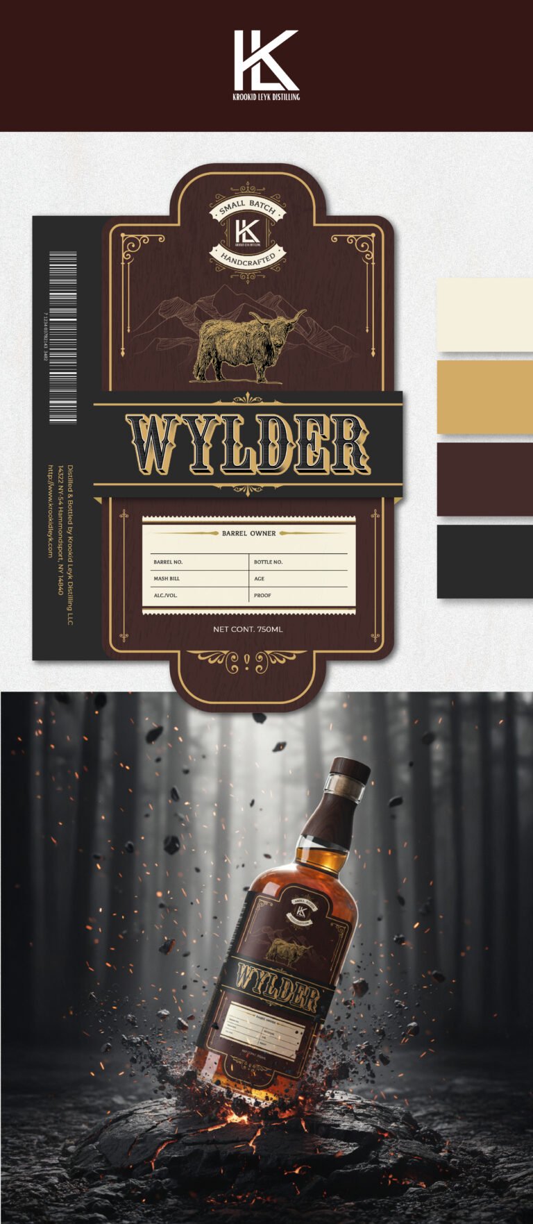
With the Wylder packaging, we wanted to move away from the polished, overly refined aesthetic of commercial whiskeys and lean into something far more visceral and elemental. The core concept here is “Forged in the Wild.” By using a deep charcoal and mahogany palette for the label, we’ve created a visual weight that feels grounded and ancient. The gold-etched illustration of the highland bull against a mountain backdrop isn’t just a logo; it’s a statement of rugged resilience and raw, unadulterated quality that speaks directly to the discerning, adventurous spirit enthusiast.
The physical architecture of the bottle was a critical focus for us. We’ve combined a classic, stout silhouette with a bespoke wood-grain neck finish, which bridges the gap between the forest and the glass. The label itself utilizes a modular, “ledger-style” bottom half, providing a space for batch numbers and distiller notes. This design choice signals to the consumer that they aren’t just buying a mass-produced liquid, but a specific, limited-run creation that has been documented and verified by a master craftsman. It’s that “hand-stamped” feel that builds immediate trust and perceived value.
To launch this, we’ve placed the bottle in a high-impact environment that mimics its origin story: emerging from volcanic rock and embers. The sparks and floating charcoal in the visual aren’t just for flair; they represent the charred oak aging process and the “heat” of the spirit itself. We want the consumer to feel the warmth of the hearth and the intensity of the forest before they even pop the cork. This isn’t just a bottle sitting on a shelf; it’s a centerpiece that tells a story of fire, wood, and time.